For my product I want to create a new brand of chewy sweets; such as Starburst, Fruittella or Chewits, tageted at children.
Due to many people and brands (such as Mars) being against advertising for children, I am going to use strategy similar to Kinder in order to target my audience, I am going to market my product at parents who will then buy the product to their children.
To do that I am going to make my advert appeal to children who then will hopefully be interested in the product and persuade their parent to purchase the product.
Name of the product:
After conducting a research on exciting brands, I've concluded that usually the name of the product is associated with a product itself. Therefore I want the name of my product to reflect the product.
I've came up with a coupe of possible names:
1. Arcobaleno - arcobaleon means rainbow in Italian. Rainbow usually symboliaes happiness and brightness, therefore my product might be associated with happy times. Also rainbow would reflect my product as my product will be colorful like the rainbow.
2. Chews - I believe that this name would perfectly reflect my product, however there's a brand with similar name , "Chewits" and I don't want my brand to be mistaken by another.
3. Bambino - bambino means children in italian, which reflects part of my target audience and it's also quite short and easy to remember name .
In conclusion I believe that "Bambino" is a perfect name for my brand as it reflects part of my target audience, as well as it's short and catchy name.
Choosing a slogan:
Slogan is important, as it's usually associated with a brand and it usually delivers some sort of message to the audience, as well as slogan can reflect companies ideologies.
Some of the options for my brand:
1. Bambinos love bambino
2. Bambinos approve
3.Spirit of bambino
I've decided to use "Bambinos approve" as my slogan as it suggests that children like the sweets and therefore parents will be more likely to buy them in order to satisfy their children needs.
Choosing flavors:
Most sweet brands have very similar flavors; strawberry, orange, blackcurrant and lime, and therefore I want to make my sweets different and stand out from the rest of the brand and give it slight USP of unusual flavors.
Some of my ides include:
Grapefruit (Soft orange wrapper)
Grapes (Purple wrapper)
Melon (Green wrapper)
Mango (Orange wrapper)
Coconut (White wrapper)
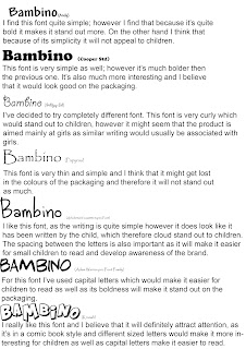
Choosing a font:

Choosing a colour scheme:
To chose a colour scheme for my product, I've looked at psychology of colour and how colour can affect behavior.
After conducting a research on colours I've created a a few possible colour schemes:
 1.This first colour scheme contains warm yellow, soft orange and pale green.
Yellow is believed to be a happy colour and it also can stimulate the feeling of increased energy levels.
Study conducted in Harvard university in 2012 has shown that foods with green labels on them are believed to be more healthy and sales of foods with green labels have increased in sales. Therefore based on this research I've decided to use green in my product as it could create the similar effect.
Orange is believed to be lively colour that excites the brain and therefore if I use orange in the packaging of my product it can get the person exited about the product.
2. This colour scheme contains of colder colours; cold shade of blue, pale green and white.
Blue is believed to encourage the brain to think outside the box and be more productive as well as it can create trust and strength in brand.
White can usually be associated with purity and innocence which can be associated with younger part of my target audience.

3. This colour scheme contains blue, pink and red. I've tried this colour scheme in order to appeal to both genders, as stereotypically pink is colour for girls and blue is colour for boys.
Pink is also believed to calm down and symbolyse love.
Red is primary colour and it makes the product stand out, as well as red stimulates appetite and enhances the brain's attention to detail.
In conclusion I've decided to use yellow green and red as my colour scheme, as they are contrasting colours it will make the product stand out. Yellow will symbolyse happiness which can be associated with the product, red will stimulate appetite for the product and green will represent my product as helthy.
Final colour scheme:

Logo:
Packaging (Wrappers) :


No comments:
Post a Comment